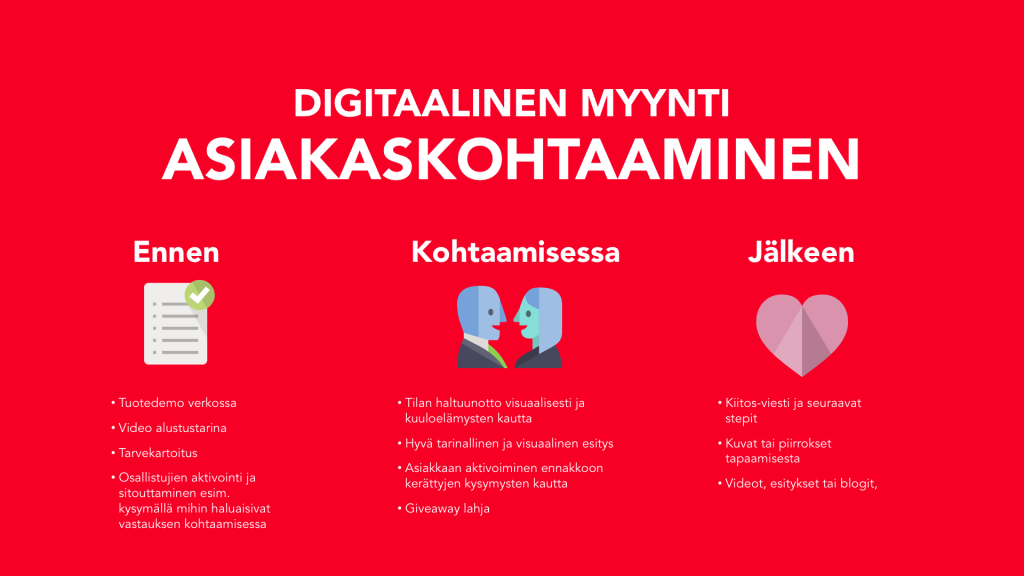
There is one favorite quote of mine that always reminds of how important Typography is: ”When typography is on point, words become images”. Actually, the definition of type and images few thousand years ago is not that distinguished, they are one and they are core and the birth of nowadays called: Design. But maybe we will talk about this historical aspect later. Today, I will introduce to you to seven basic and simple rules of typography in design for a beginner.
First thing first, I am also a beginner in typography. I followed a few groups of designers on social media and I always wowed when I saw how amazing the creators can arrange texts together. However, deep down, I am always afraid of making typography. Maybe the idea of ”being at bad at typography” encumbered my own ability. So after few years of trying to be good friends with typeface, fonts in general. I am here to share with you the basic rules that have saved me every time.
Typography is the art and technique of designing and arranging type in short. How the written words look is as important as the meaning. You can never underestimate the power of typography. ”Typography and choice of the typeface are more than simply making words legible; it is how we make content work with layout and it is absolutely fundamental to good design.” – Lauren Swarbrick.
If you want to know about the basic terms of typography first, please check out my colleague’s blog one year ago here.
Okay, so here we are. No more small talks :))
RULE NUMBER 1: YOU DON’T WANT TO USE ALL INTERESTING FONTS YOU JUST FOUND
One of the biggest mistakes of designers is using too many typefaces or fonts and different styles. Remember, 2 or 3 styles/ typefaces is just enough. Meaning, the paragraph should have one size, one font, one typeface for consistency.
You should detect four things when designing: Headline, Subheadline, Paragraph, and Highlight if needs. Don’t be afraid to choose two different styles for your design. Actually, it is highly recommended. For example, one San serif headline can go nicely along with serif paragraph. Or Script font can be used for more highlight effect.

RULE NUMBER 2: YOU NEED SPACE, TYPE NEED SPACE TOO.
Density in design is the killer for the eyes. If you encountered the trouble of fitting information in the space, for example, an A4 printing or a small card, choose a ”Condensed font”
Or simply reduce the size of the font to create room for each letter. Remember to leave margin whether we are talking about a print or online version.
The space between words makes it readable and of course, more effective.
RULE 3: ALIGN THE WORDS LIKE YOU ALIGN YOUR ARMY.
Talking about alignment, you should read more about the grid in design. I used to suck at it, now the grid is my best friend for life. We name the alignment based on the grid in design. Remember, the content is linked together closely. Good alignment will guide the vision’s flow and creates the right impact on the reader.
There are four basic types of alignments: Justified, Centered, Flush left, Flush right
Each of them has their own meaning and use case, and thus they are suitable for different situations. Be flexible. Trust your eyes.

RULE 4: SCRIPT FONTS ARE NOT ALWAYS COOL

Okay okay, I understand Script font or hand-drawing fonts are really eye-catching. I am a fan of them. My heart feels excited whenever I discover a beautiful unique font and it screamed to my brain ”Use it, Use it now!”.
However, the uniqueness of the font does not mean it will increase the value of your message. Sometimes, the font like Helvetica, even though it is boring but still really popular.
”Helvetica is the sweatpants of typography” – it is said. Because it is just simply comfy.
But the script fonts for the headline (especially a short headline), why not? It will be sugar for your eyes.

RULE 5: SIZE MATTERS
Sometimes, the size of a paragraph gives me a headache, the true headache which I can solve only by drinking paracetamol 🙁 Because it is really important.
Big and bold type is pretty as it will be remarkable. However, if you set the size of your paragraph too big, it will tend to reduce the gracefulness of the design. If you have too many texts, then it will run out of space for your words soon. And I repeat the rule number 2: SPACE, texts need to breathe too.
Of course, please don’t play hide and seek with readers if you let the size too small.
And don’t be afraid to increase the size gap of the headline and the paragraph. Separation of these two is a good thing for your design.
So what is the best size? The answer is none. Practice makes perfect. (That is why it gave me a headache hahaha)

RULE 6: READABILITY NEEDS TO BE ON POINT.
“Type is a beautiful group of letters, not a group of beautiful letters.” The highest meaning of design is convey meaning. Without readability, typography will just be an image without meaning.
And readability here is please don’t put the dark color texts on the dark background. Or even worst, if you put the small thin ultra light font on the abstract background. In the case you want to hide information on purpose, so yes, please do.
So in general, give a favor for the readers by making sure the text is clear.

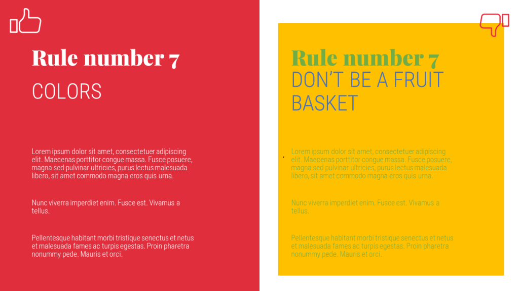
RULE 7: THERE ARE PAIRS OF COLOUR AS BAD AS YOUR EX-LOVER.
Even worse than rule number 6, if you put two colors which are not getting along well with each other in the same design. You make it ugly. And some case, ugliness is insufferable than being unreadable. 🙂
Black and white a long life partner. Others combination, please check out the color palette or coolors or another blog from Havain about color theory.
One small tip: befriend with gray color. Because grayness will make things stand out. So when using colors, designers will tend to reduce the saturation of the color for readability.
So at the end of this post, I hope my share brought value to you. I hope next time, your presentation or your word documents will be on point both in visual, readability and impact.
Can’t wait to see you with the next blog post.
Follow Havain on Social media
We will come back with more tips, tricks, tutorial videos, and give away to help you with your presentations.
Best,
Lacey Nguyen