
Typography is one of the most important features that matter to your presentation design. Good typography can make big differences: creating readable content, emphasizing important words and influence audiences’ moods. Therefore, we would like to introduce you to the world of typography, and the journey starts with basic knowledge of some common typographic terms.
Anatomy of types
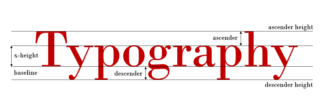
Baseline:
Baseline is the imaginary line, on which most letters and characters ”sit”.
x-height
x-height is the height of a typeface’s lowercase letters disregarding ascenders and descenders, or the height of letter x.
Ascender
Ascender is the part of a lowercase letter that rises above the main part of the letter, or exceeds the x-height. Only some letters have their ascenders such as h or l. Ascender height is the height
Descender
Descender is the part of a lowercase letter that goes below the baseline. Only some letters have their ascenders such as g or y.
Type classification
Serif
Serif refers to a typeface category that includes short lines or strokes attached to an open end of a letterform. People use serif typefaces in printed documents and books, since it is considered to be easier to read for human eyes. It is also viewed as more formal and traditional.
Some notable Serif types are: Times, Baskerville, Garamond, Century, Bodoni, Didot.
Sans Serif
As ”sans” means ”without” in French, Sans serif types are typefaces that are without the short lines coming off the edges. People usually use sans serif on digital devices and screens. Sans serif delivers a more modern mood to your design, as compared to Serif typefaces.
Some notable Sans Serif types are: Arial, Verdana, Open Sans, Helvetica.
Script
Script refers to a typeface that resembles handwriting. It is beautiful and elegant. Besides, it is used usually on headings and invitations but is strictly forbidden if you would like to use it in all-caps. Body text may not be so compatible with script types since it focuses on legibility.
Decorative
Decorative, or sometimes known as Display types, is the largest category and also the most diverse. People tend to use decorative typefaces for headlines or signages and not so popular with body text. It can help to evoke emotion, represent cultures or time periods.
Adjustment
Tracking
Tracking is the action of adjusting equally the spacing among the letters throughout an entire word. It can help to fit the texts that are currently larger or smaller than the spaces allowed.
Kerning
Kerning, which is usually confused with tracking, is also adjustment of spacing. However, it is only for the distance between two letters. Kerning can assist in fixing the distance between two letters in one word when they seem to be too narrow or far away compared to other letters.
Leading
Leading is the distance from the baseline of each line of text. It maintains the legibility of the paragraph, since if the distance between lines of text is too narrow, it will be really confusing for people to read. Normally, the default setting for leading distance is 20% more than fontsize, but it can vary depends on your choice of style.
I hope these basic typographic terms can help you better understand typography world and its rules for better design. Stay subscribed for more articles about design and typography, or check out some of our older articles about other design elements such as Color theory & how to choose the right colors for your design!