
I met Petri Kainulainen at Engineer in Marketing meetup in Helsinki. Petri is a brilliant software developer, blogger and author. He gave a great presentation with valuable content for anyone who writes a blog or aspires to write one.
As many other presentations, this presentation uses a template which has all the conventions of traditional PowerPoint (or Keynote, if you´re Mac): text, bullets, layouts with title on top and text in the middle. Sure, it is a quick and easy way to write down your thoughts, but it is not an optimal way to support YOU as a presenter nor does it help you to stand out from the ordinary.
Example 1 – Before
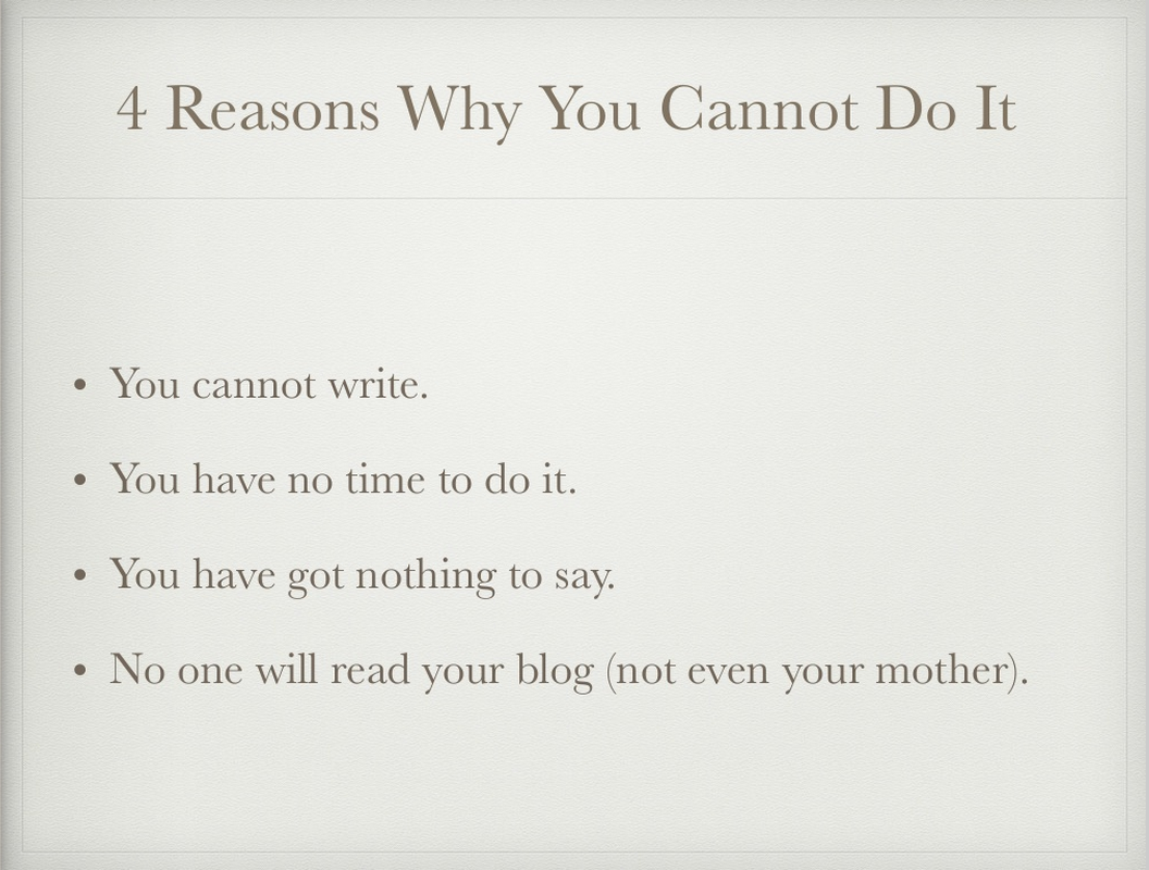
The problem: Presenters often tend to think that less slides equals a better presentation. The right (and only thing to) measure is your presentation time. In this slide the presenter is going through four myths about why people think they cannot write a blog. The fact is that the audience has read most of the points before the presenter has even finished talking about the first. Many of them may have checked out of the presentation before the presenter is finished with the slide.
Example 1 – After
The solution: Instead of thinking slides, think time. Breaking down each talking point as its own presentation slide takes the same amount of time as going through them on one slide. But this way you are not giving your audience the chance to check out of your presentation. Presenting only one idea per slide also helps in using images to reinforce the ideas. As you can see in these made over slides each point is reinforced with a nice full size photo that conveys the core idea.
[rev_slider alias=”techauth-1″]
Example 2 – Before
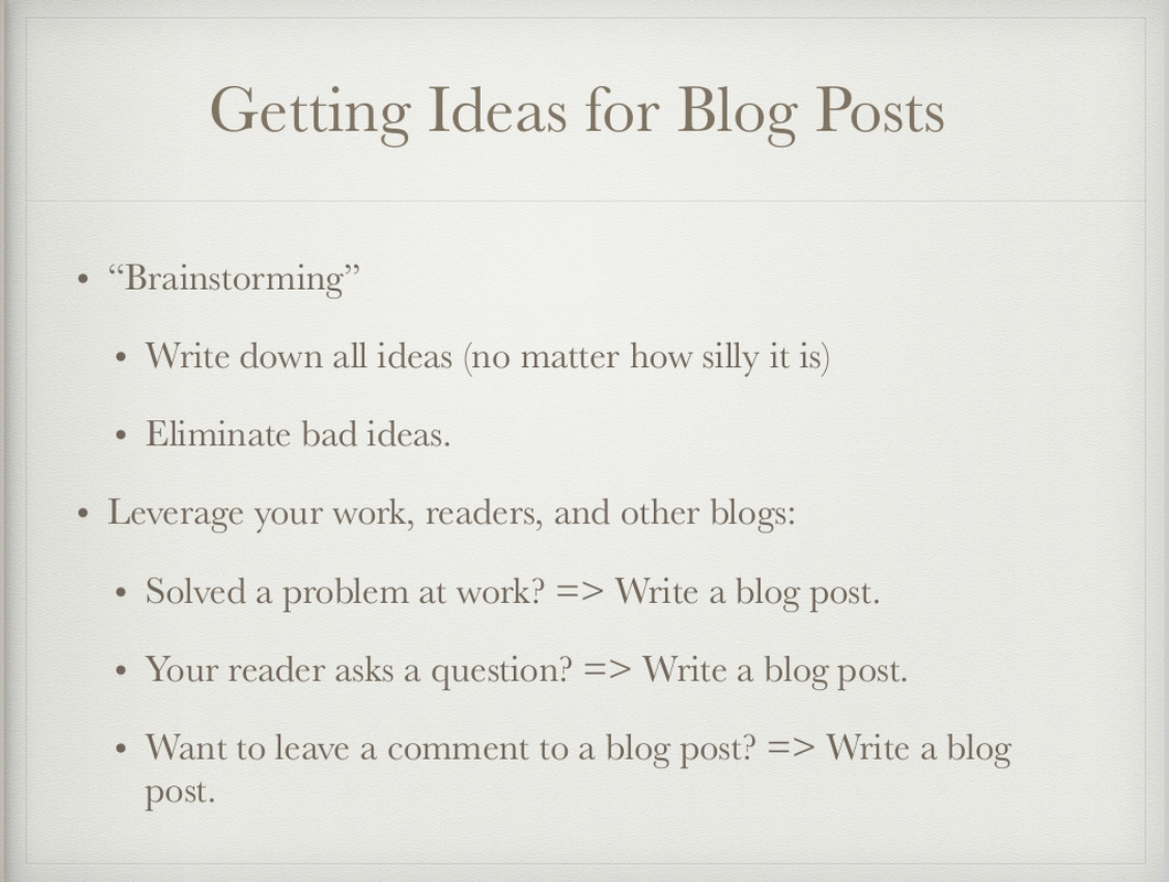
The problem: Sometimes you may be facing a situation that you need to write a bit more text on your slides. Here´s one example in which Petri has listed some sources for blog post ideas. Having it written out in your presentation may be necessary so that you don´t forget anything or if you will distribute the slides afterwards. Once again you can be more creative here than just use the traditional bullet point and text template.
Example 2 – After
The solution: You can intentionally make the text so small that the audience cannot read it. This way you are not diluting your own value in the presentation situation and later the audience can come back to the content and read it more thoroughly in the handout or PDF or Slideshare that you give them. Because excuses “to not write a blog” were each presented on their own slide, it is now easy to maintain the connection between the excuses and Petri´s ideas about how to overcome that excuse.
The whole presentation makeover
You can see the difference between a traditional approach and more visual approach to PowerPoint by comparing these two Slideshares:
[slideshare id=47293526&doc=technicalauthorshipinpractice-150422102857-conversion-gate01]
[slideshare id=47347965&doc=technicalauthorshipslideshare-150423151832-conversion-gate01]
This was in no way a bad presentation to start with. It had great content, it was well-structured and Petri´s delivery was relaxed and fun. But I thought it could become even better by taking a more visual approach to the presentation.
And that is also what I encourage you to think the next time you are preparing a presentation. How can you make your presentation to stand out from the traditional PowerPoint? Can you turn a good presentation into great by giving a bit more thought on how you will visualize your message? Would that give you more “airspace” as a presenter? And could that lead to better engagement from your prospect?
Let me know what you think about this makeover. You can contact me in Twitter (@Timo_Havain) or by email (timo@havain.fi)