
”Icon is a symbol or graphic representation on a screen of a program, option, or window.” – Cambridge Dictionary
The word ”icon” in Latin means similar, likeness and images. It first appeared before the 16th century and has now become familiar thanks to the age of internet and graphic design.
As it is stated above, the purpose of the icon is to represent something. It does the excellent work to make people feel less suffered from reading two many texts. One average person is bombarded with the equivalent of 174 newspapers worth of data every day, so big thanks to ICONS for making life easier.
How many times do you feel bored in the class, in the meetings with 100 words on a presentation slide? For me, it is countless.
So instead of words, using icons catch more the attention of audiences and give you more content to present, not just read the content for the listeners.
If you are searching on Flaticon – the biggest icon flatform for designers, it is so easy to find different types of icons: Open lines, monoline, flat, fill, linear, round, square, etc. But to sum up, here are the three biggest types of icons:
Mono-color filled icons


Color filled icons

Linear icons

”USE ONLY ONE TYPE OF ICON FOR YOUR CONTENT”
Using more than one type of icon in your content will 100% create counteraction. It decreases the consistency of the content, and the presentation will soon be a mess. If you choose to go with linear or fill, make sure every icon in your presentation belongs to that family.
One more note to remember, please don’t make your presentation turn into a fruit basket. If you decide to use colored icons, remember to follow the graphic guideline’s colors.


”FLAT DESIGN IS THE RULER”
Recently, line icon has been one of the trends taking over the Internet and design world. It is said to be elegant, simple and classy.
If you are still using the colorful 3D icons with cheesy effects of 2000’s style, please strongly consider changing. 2D design or Flat design is ruling the world now.
![]()
”MORE ICONS LESS TEXT”
When you present to the audience, people can only focus on one task: listening or reading. If you have too much text on your slides, nobody’s gonna listen to your speech. Therefore, to create better impact, less is more.
You can read more about why you should use icons in your presentation here.
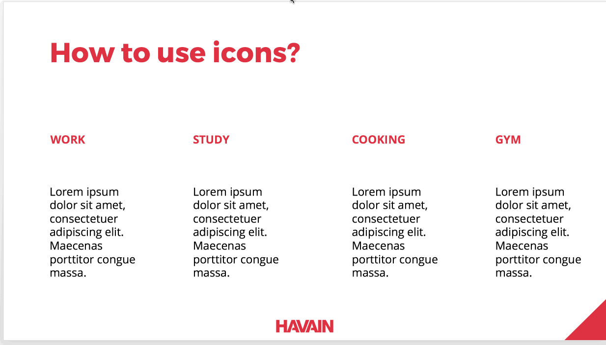
One paragraph can be replaced by an icon. Moreover, give your icons space to breath, and align them with text nicely for the best result.
You can find icons easily just by googling at the moment, but the best sources by far for the icons are:
Flaticon
My all-time favorite source is Flaticon. I cannot express my love for this website. It is so easy to use, mostly free, different types of formats are given.
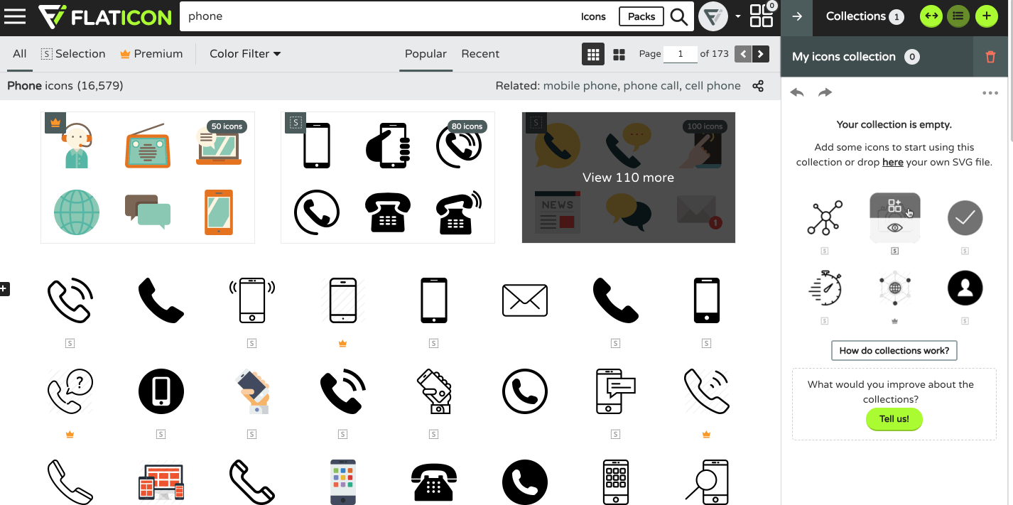
With a free account, you can easily create a collection (up to three) and start adding your favorite ones into one place and download them as a Zip package
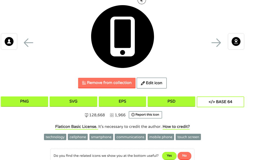
Please note that SVG and EPS formats are more accessible in Adobe Illustrator.
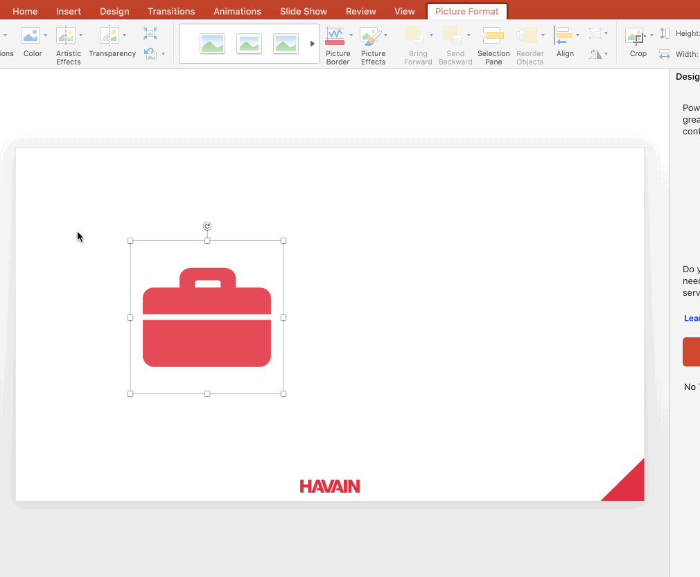
For Windows users, it is easy for you to drag the file Svg or Eps into PowerPoint. However, for Mac users, you should choose Png format before downloading.
One more tip for Mac users, icons which are dragged into PowerPoint will be shown as a ”Picture”, not a ”Shape”. So if you want to change the color to fit with the theme, you can follow these steps: Picture format – Color Correction – Change color.
The Noun Project
As a Mac user, it is such a time-consuming way for me to search and download and unzip and insert the icons into my presentation. But with the help of ”the Noun Project”, I save half of my time when making any presentation.
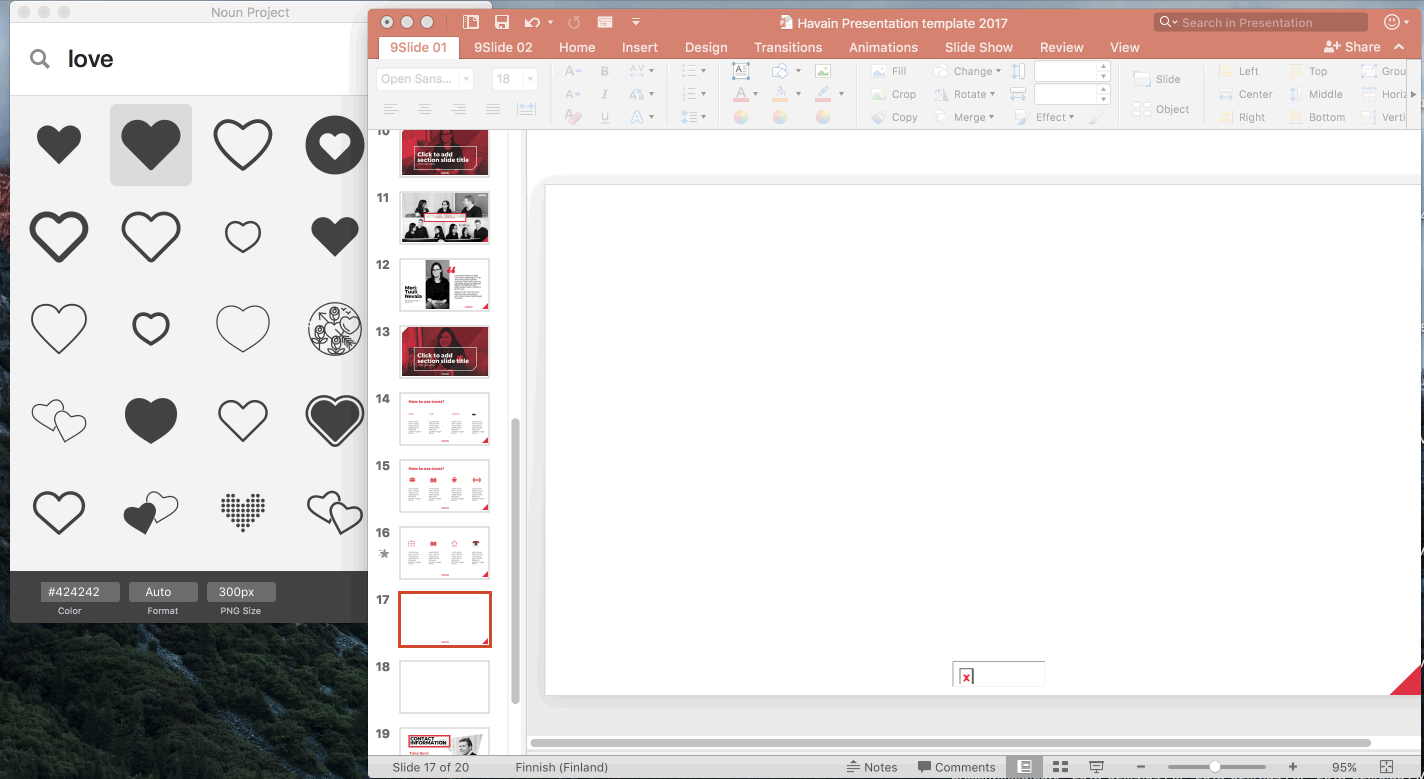
The noun project is an application you can download to your computer. You search and change the color of the icon as in the video above and drag them into your slides.
Fast, convenient with many trendy styled icons, the noun project is becoming my most favorite one.
And the list continues with:
Freepik
Shutterstock
Smashing Magazine
In the end, I hope that this post will help you have better resources for your presentation. Havain will come back soon for more blog posts related to presentations and design.